


1
2
3
4
5
6
7
8
9
10
11
12
13
14
15
16
17
18
Chrysler modus Identity
Chrysler modus Identity / Entry Identification
Client: RPA (now Fitch) for Chrysler
Credits: Naming: Tim Smith; Identity and Environmental Graphic Design: Tim Smith, Interior and Fixture Design: Michael Torok; Account Management: Aaron Spiess
Retail Design Institute
After years of research and a year of brand positioning, the Institute of Store Planners (ISP) changed its name to the Retail Design Institute. This new Identity helped usher in a new era for the highly-regarded organization. While intended to represent the essence of a physical or virtual environment, the logo secondarily incorporates the letters “r” and “d” as a mnemonic for retail design. The identity has been implemented internationally in the organization’s communications, educational materials, social media and at the annual International Store Design Awards Gala.
Client: Retail Design Institute
Credits: Creative Direction: Tim Smith, Andrew McQuilken; Design: Tim Smith
NOGOLOGO Show Logo
Awarded several times over and published in design publications internationally, this logo demonstrates the effectiveness of a powerful, yet implicit mark. The logo helped garner recognition for this very successful event and has lived on in various iterations through other AIGA chapters nationally.
Client: AIGA Cincinnati / Columbus Society of Communicating Arts
Zales logo
Leveraging the equity of their well-established identity, this more elegant, contemporary logotype is still recognizable to Zales’ existing customers, but ultimately appeals to a broader audience. The symbolism of “The Diamond Store” is captured within the “A”.
Client: FRCH for Zale Corp.
Credits: Creative Direction: Tim Smith; Graphic Design: Tim Smith Lucy Steadman, Doug Bunker
Brennan Capital Partners Identity
Self-described venture catalysts, Las Vegas-based Brennan Capital Partners provides investment capital for start-ups and fledgling companies. In a field crowded with stodgy brands, their’s needed to capture the imagination of the companies they hoped to attract.
The “bcp” letterforms are custom-drawn in this contemporary escutcheon which serves as the foundation for the brand’s cornerstones: honorable, fair, client-centric and integrity.
MetroMamma Identity
This progressive company’s MetroWrap baby wrap quickly became a favorite among stylish urban moms and even celebrites, with mentions in several noted magazines. The logo is a stylized represntation of the signature product, not only quickly identifying the essence of the product, but doubling as the brand’s initials.
MetroBebe Logo
Logo for MetroBebe – a truly unique line of children’s gear designed to be noticed, yet uncompromisingly comfy. The letters “M” and “B” are woven together to form this memorable mark. MetroBebe is a division of MetroMamma, thus sharing the same typographic treatment and complementary color scheme, allowing for a consistent familial appearance in marketing materials.
Identity for Ted Rice, Photographer
For noted reportage photographer Ted Rice, a rice kernel becomes a logical mnemonic device to aid in recall – and bring a smile to few faces, reflecting the photographer’s subtle wit. The tagline “People Pictures” reinforces the identity and Ted’s specialty: taking pictures of people. This memorable solution has been featured in “Dynamic Graphics” as an exemplary identity makeover.
Client: Ted Rice Photography
Hepp Consulting Logo
A former telecommunications executive recognized for his ability to bring resolution to complex challenges needed a memorable manifestation of those skills to symbolize his consulting practice. The iconic “H” with a subliminal embedded “C” not only helps with retention but the resulting labyrinth reinforces the identity’s objectives.
Client: Keith Hepp, Hepp Consulting
Digital-Cocktail.com Logo
In the throws of the 2000 tech implosion, creative and IT professionals in Columbus, Ohio launched Digital Cocktail as a means of gathering that like-minded community monthly at various venues to share cocktails, stories and pink slips. The event became very popular, often attracting 200-300 people.
Burns Auto Parts Logo
A tough audience (jaded art directors, designers and art buyers) requires an attention-getting and memorable solution. The name was adopted from the owner’s grandfather’s auto parts store from the mid 1900’s, with the intent of building an identifiable, if not offbeat brand, through unusual promotions based on the auto parts theme. The logo has won praise from this very tough audience, but more importantly has been a very effective foundation for a successful business.
Client: Lesle Burns-Del’Acqua
Credits: Design and Custom Typography: Tim Smith; Naming and Creative Vision: Lesle Burns-Del’Acqua
DirectorsForum Logo
DirectorsForum was developed by Tim Smith for a former employer as an effort to get all directors within the company to share ideas, resources and to offer solutions for company-wide operational issues. Considering our reasoning as to the importance of effective branding, this logo was developed to help establish the Forum as a legitimate entity and generate interest. It did exactly that.
Client: LPK
Credits: Concept and design: Tim Smith
Marblecliff Design Studio Logo
Marblecliff Design is a small interior design firm in Columbus, Ohio that specializes in residential services.
Palinet Logo
Palinet (now Lyrasis) is the nation’s largest regional membership organization serving libraries and information professionals. Tim Smith Design conducted research to determine key brand attributes – both existing and desired. The move toward a younger target audience, a significant shift in the role of technology and the need to communicate collaboration and community led to this dynamic solution.
Client: Palinet
German Village Guesthouse Logo
A great example of the potential of the client/designer collaboration. The colors were based on the palette used in parts of the interior of the restored residence. The logo used the inherent symmetry of the letterforms and suggests the intimacy of the environment. Much of the early success of the Guesthouse has been attributed to our branding efforts.
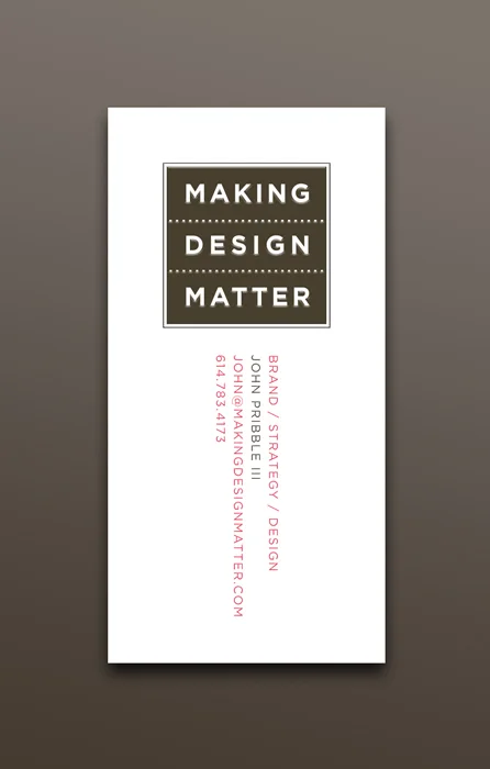
Making Design Matter Idenity
Founder John Pribble has an extensive background in design-related fields, having worked in multiple capacities for pioneering multidisciplinary design firms, prominent regional ad agencies and and juggernaut global internet consultants. When John wanted to launch “making design matter” he came to Tim Smith Design for a solution that would convey that very sentiment.
The business cards (shown here) are printed on a letterpress for a rich tactile experience that reinforces the importance of the meaningful expression of brand.
WeatherGeek App Icon
Featured in “New & Noteworthy” and the number 5 top paid weather app right out of the gates, this app is the first to let users view the same numerical weather model data meteoroligists use to develop their forecasts. The icon was the first and only consideration in this instance and has given great pleasure to weather geeks everywhere.
WebSprockets Logo
WebSprockets provides Web design and hosting services as well as Web application development. At the core of it all, they build things that work on the Web. The new logo needed to be suggestive of the name and allow for multiple adaptations accross various media.